
Branding
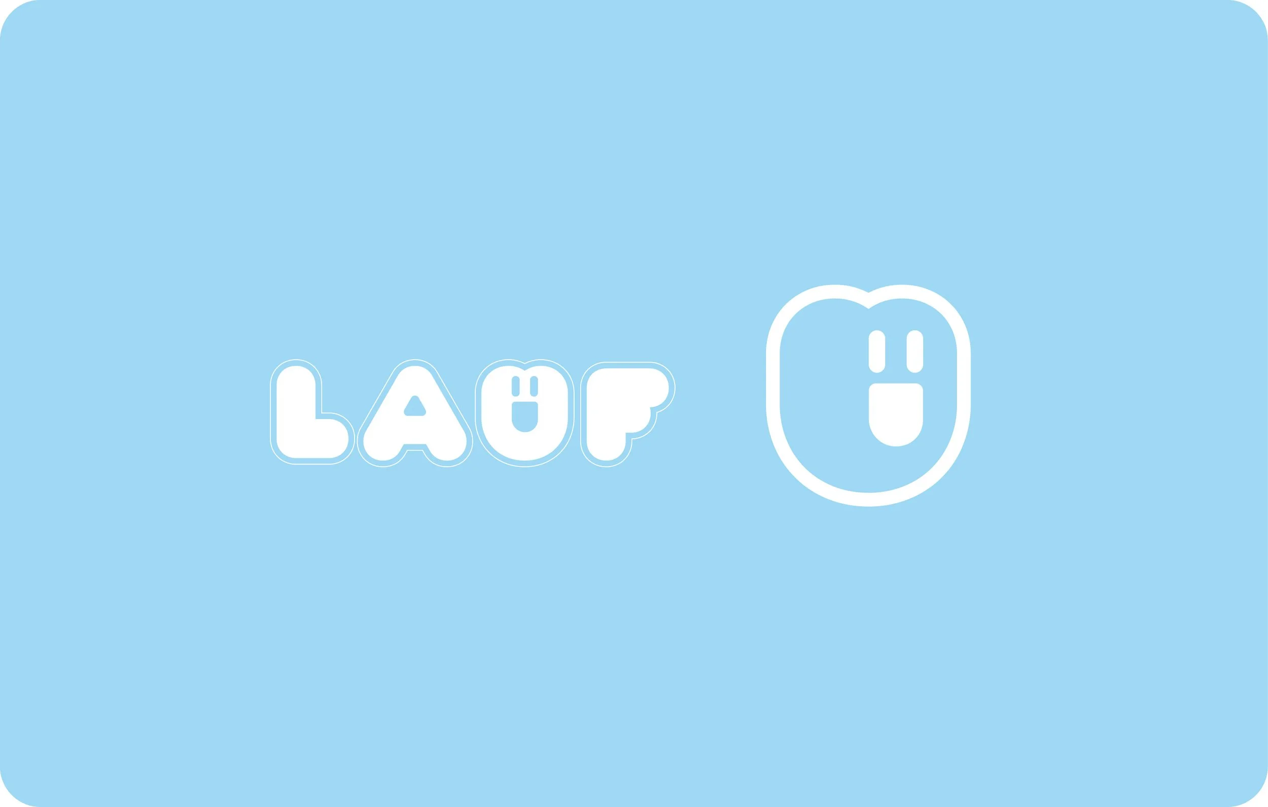
With the logo for Lauf, I wanted to create something instantly fun, bold, and expressive that brings a sense of joy and positivity to the brand's identity. By using chunky, rounded lettering, the design has a playful, bouncy energy that feels approachable and lively, especially against the bright, friendly blue background.
To capture the heart of the brand's mission of giving back, I integrated a happy face right into the ‘U’ of the wordmark. This charming addition, along with the larger companion smile icon, acts as a visual signature that reminds the audience of the good will and community joy behind every exclusive drop.
lauf
The One Brain Cell Podcast features two friends who discuss video games, life, pop culture and fun news stories and are so close they are considered to share one brain cell among themselves.
For the logo, I aimed for a retro '80s news broadcast look, using a soft purple neon glow to mimic the nostalgic warmth of an old CRT screen. The bold, ultra-heavy typography gives the mark a massive, high-impact presence that feels straight out of an old-school newsroom bulletin.
To tie in the show's title, I embedded subtle brain-cell-inspired iconography right into the letterforms, hiding a spark and nucleus-like shape within the counters of the "O" and "B". The result is a clever, retro-inspired logomark that balances high energy with a nod to the podcast's playful concept.